 When making decor decisions, many homeowners gravitate toward a neutral color palette, and for good reason: the best neutral rooms have maximum staying power and create a relaxing vibe—which also happens to be perfect for lake living. But if you think beige means boring and gray means dull, read on to find out how you can create a neutral scheme that really stands out.
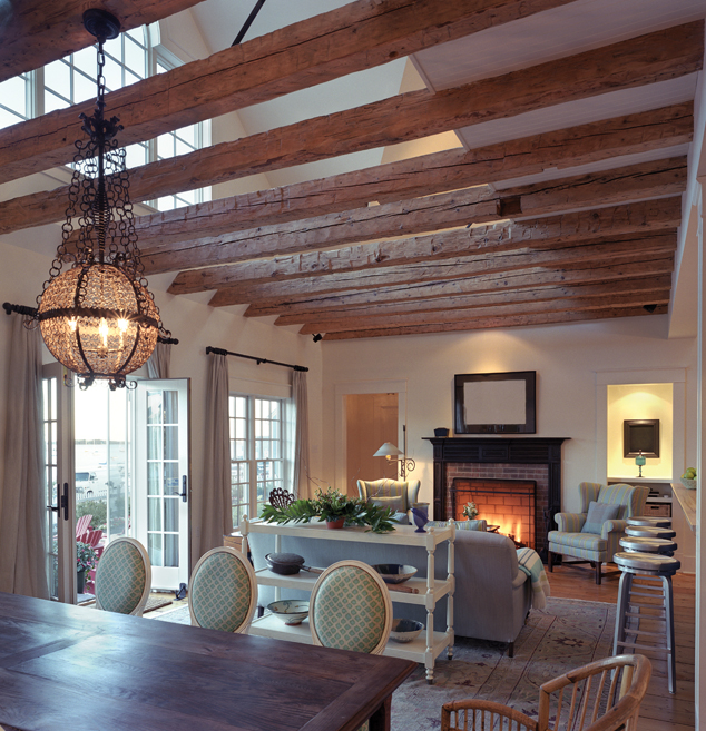
“The point of a neutral palette is to be soft on the eye, and to focus the attention on something other than color, like a great architectural detail or a wonderful view,” says Sydney Dalton, a designer with PAC Interiors and Floor Fashions in Moneta. Is there a stunning lake scene or mountain vista outside your window? Show it off with a subdued palette that lets your view really shine. Or if you’ve invested in beautiful woodwork or a rustic beamed ceiling, draw the eye to it by muting the color scheme; loud walls or furnishings will detract from the best your room has to offer.
Vary the Shades
 Pick up a beige paint strip from the hardware or paint store, and you’ll see that though all the colors on it could be classified as beige, they are all varied in tone, which makes them more interesting when viewed together. Think of your room this same way; varying the tones of your chosen color or colors will create depth and interest.
“If you don’t use different shades, the room will be one big blur and nothing will stand out,” says Janice Thurman, decorator and owner of Envisions Distinctive Interiors in Wirtz. “You’ve got to have some contrast.”
You can aim for variation by choosing different but coordinating tones for the upholstery, walls, flooring, window treatments and accessories. Viewing samples of paint and swatches of fabric and flooring together is helpful before making final selections.
Neutral doesn’t have to mean white, cream, gray or beige; green, blue and even pink in very muted shades can read as neutral, too. But if you are choosing a paint color, Thurman says be sure to paint a large sample board and hang it in the room, since lighting can drastically change how a paint color appears. A tiny paint chip that looks like a hint of green might be too dark in your room, throwing off the vibe you are trying to create.
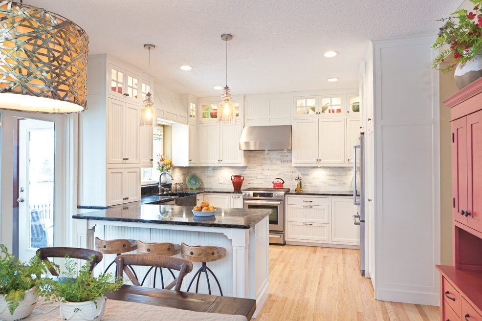
“The new neutral that has taken the design world by storm is gray,” says Jessica Wimmer of Designer Solutions in Moneta. “Gray is seen in everything from fabrics to hardwood flooring to cabinetry and countertops. Whether your design concept is traditional, transitional, contemporary, coastal or rustic, there are some beautiful gray tones that work well with them all.”
 If you are following the gray trend, a way to make your room cozy instead of concrete cold is to go for a warmer gray, or a greige (gray/beige). Some jumping-off colors to try on your sample boards are Benjamin Moore Pale Oak (OC-20) or Sherwin-Williams Keystone Gray (SW 7504).
If you’ve stayed in a neutral zone and varied the tone of your flooring, walls and upholstery, you can have fun with pops of color in your accessories. These can be swapped in and out with the change in seasons, or if you are prone to boredom, it’s a great way to mix it up without spending a bundle. Looking for an “it” color to punch up your palette? Try burgundy with your gray scheme, says Dalton. “Burgundy is a dramatic color that brings a rich warmth to the space and really complements grays well.”
Red is always a good boost for beige; watery blues paired with beige evoke a sand and sea palette that is tried and true, and shades of green in a neutral scheme bring the outdoors in.
If you are looking for a final color touch in a room, go black. Like the little black dress in your wardrobe, black is a hardworking color that, in small doses, never disappoints. “A little bit of black in a room can ground things,” says Thurman. “A collection of black frames works, or try a black lamp or lamp shade.”
Emphasize Texture
 When your colors are muted, texture takes the stage. This is an opportunity to treat the eye with different fabrics and materials to add layers of interest to the room and is an absolute must in a neutral scheme.
“Don’t by shy about texture,” Dalton says. “Go with what feels good and appeals to both touch and sight.” She mentions faux fur, leather, pieces of furniture with raw wood edges, and warm metals like bronze and copper.
When color isn’t the key player, shapes are also more evident. Interesting shapes, like a driftwood lamp or a hammered metal side table, will get maximum impact when they are allowed to shine in a neutral scheme.
A rough-hewn wood floor, a large-scale geometric print rug, and textured wallpaper are other ideas to add layers to your room. And don’t forget to look up: a painted, wallpapered or planked ceiling are all options. A stunning light fixture that combines textures and finishes, like burnished metal with rope, adds visual interest in an unexpected place.
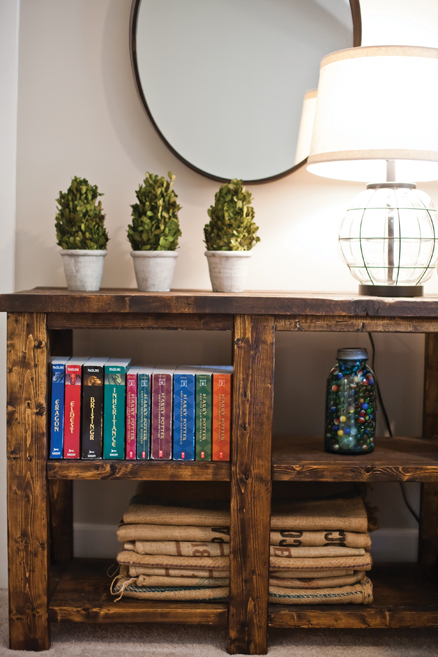 Some easy ways to bring texture into the room? Thurman likes baskets, and a few interesting pieces for a bookshelf or display that speak to the homeowner’s interest. While experts caution us to stay away from going too far with obvious themes (like boating, for example), a beautiful model boat or another treasure can be a great addition to the room.
Some parting advice on texture? “Matchy-matchy is a bad thing,” says Dalton. So don’t walk into a furniture store and buy the matching couch, love seat and chair. Vary the materials and shapes, and your room will look collected instead of straight off the showroom floor.
Another way to add visual impact is with prints and patterns; they have a place in neutral schemes as well as colorful ones. If all of the upholstery, rugs and window coverings are solid, this is when neutral leans towards boring.
“Prints are a great way to add a little personality and excitement to the overall neutral scheme,” says Wimmer. “There are also some great prints that maintain a neutral background but add in some light pops of color to really set them apart in the room.”
If picking out patterns and prints overwhelms you, consider working with a designer to help you tastefully incorporate them into your room.
“Don’t be intimidated by working with a designer,” says Dalton. “People are often drawn to multiple different styles, but sometimes when put together the flow in the room doesn’t work. We are trained to make the flow work, and take the stress out of the process.”