Photography by Michael Patch
THE KREGER AND NICHOLS TOWNHOMES WERE BUILT TO BE IDENTICAL BACK IN 1995. THEY STILL APPEAR IDENTICAL FROM THE OUTSIDE, AND THEY HAVE THE SAME FLOOR PLAN.
Island Green Pointe, a popular neighborhood in the Water’s Edge community, is situated directly on the lake and offers its residents a relaxed lifestyle with waterfront views, covered boat slips, lawn care, and amenities at the nearby Water’s Edge Country Club. It’s no wonder that long-time Smith Mountain Lake homeowners Pam and Trip Kreger and Christy and Joel Nichols decided upon the townhomes at Island Green Pointe when they were in the market for a vacation homes that their grown children and grandchildren would want to return to year after year.
The Kregers and Nichols have been friends for many years. Starting as neighbors in South Roanoke when their children were very young, they cultivated a friendship that now spans decades. In 2014, the Kregers were the first to purchase in Island Green Pointe, followed fortuitously by the Nichols the following year. It was a pleasant surprise for both couples. “I’ll never forget,” says Pam Kreger. “I was down at the dock reading and I heard these voices. I thought, ‘Goodness, that sounds exactly like Christy and Joel!’” Searching for a new place in 2014, the Nichols were aware that their friends had relocated to a new place at the lake, but didn’t know where. Joel remembers spotting Pam on the dock that day. “Christy and I were delighted to find our old friends were nearby, and it was one of the things that told us that this was the place for us,” he recalls. It turns out their house hunts had led these old friends to the same place. Shortly thereafter, the Nichols purchased the townhome two doors down, and now the friends are neighbors again.
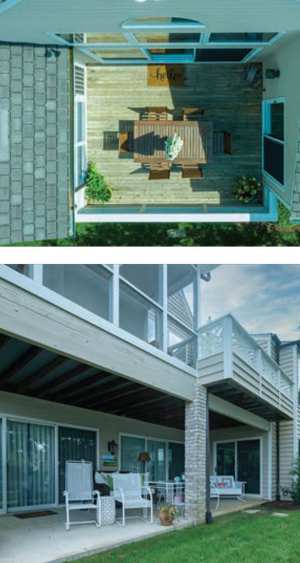 To call these residences “townhomes” belies their nature as sprawling family homes. At 3,600 square feet with five bedrooms, these homes have all the room that extended families need. The Kreger and Nichols units were built to be identical back in 1995. They still appear identical from the outside, and they have the same floor plan: open concept kitchen/ dining room/living room with vaulted ceilings supported by a brick chimney that spans both the upper level and lower level of the home. Both homes were built with two bedrooms on the entry level and three on the lower level, a large porch, partially screened, and a two-car garage, accessed through a spacious laundry room. Over the past few years however, the two couples have each brought unique ideas to the interiors of their homes, each drawing on their own thoughts of what a lakeside haven should be. The Kregers and the Nichols have, over the course of years, and with the help of a talented designer and collaborative team, brought their particular visions to very different realities.

COLORFUL, UPDATED, FUN
Pam and Trip Kreger, Roanoke natives and high school sweethearts, fondly remember Smith Mountain Lake as an important touchstone for their lives together. They grew up coming to the lake, went on dates there as teenagers, and took their family there as adults. Pam and Trip own and run A.B. Kreger Company, a manufacturers’ representative company in Roanoke. They spent most of their time in Roanoke when their children were at home, but once their children were grown and launched their own careers, the Kregers began to feel the tug of the lake once again.
“We started taking picnics out to the lake on Fridays, and it wasn’t long before we wished we could stay the whole weekend,” says Pam. “I’m not a fan of camping, so we started looking for a place of our own.” The couple started with a small condo in Marina Bay, and realized they wanted more room for the entire family to be able to stay: parents, siblings, adult children, cousins and friends. The Island Green Pointe townhouse was a perfect fit.
Pam, who describes her home in Roanoke as “very traditional—lots of dark wood and Oriental carpets,” knew that she wanted a very different feel when furnishing and decorating their lake house. One of the first purchases the couple made for their place was a large color-saturated oil painting from local artist Mary Bullington to hang in their front hall. It was from this that Pam took her inspiration: “I saw that painting and thought: ‘Yes! I want vibrant colors like THIS at the lake!’”
Pam engaged the services of Emily Mangus of Emily Mangus Interiors Inc. in Roanoke to help her realize her vision of a fun, bright, and above all colorful space that would be a comfortable place for the family to gather. “I know what I like, but I’m not good at putting it all together— and I’m terrible at accessorizing,” says Pam. “Emily has been an enormous help. She has such a good eye.”
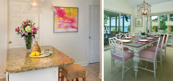
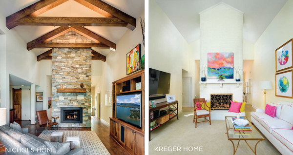
To accomplish the dramatic pops of color that the Kregers were hoping for, Mangus and Pam decided to keep the walls and floors as neutral as possible to provide a backdrop—rather than competition—for the sun-drenched colors that Pam loves. The goal was to give the 1990s townhouse an updated feel. Mangus also helped the Kregers update fixtures to give the townhome a facelift without needing a full-scale renovation. Even the brick fireplace and kitchen cabinets were painted a creamy white to blend with the walls and trim. From the neutral backdrop, they slowly began to add the color, finding the right balance to suit the space.
The entry features two paintings: the Mary Bullington oil over a small table, and a watercolor by Julie Hamilton of the surrounding mountains on the back of the two-story central fireplace which divides the entry from the living room. The stairs to the lower level mirror the clean unfussy feel: simple white walls, an elegant light fixture with a rectangular shade, a gallery wall featuring a collection of ten black and white family photos identically framed and matted. Aside from the paintings, the only real pop of surprising color between the entry and the kitchen comes from the adjacent powder room, a bright happy space, papered in a bold Kelly-green geometric chosen by Roanoke designer Julie Lawrence, giving the room an outdoor garden feel. You almost have to look twice to see that there is no exterior window in the room.
The dining room and connecting living room also have a light and airy feel. The large masonry central fireplace supports the vaulted ceiling, but painted white, it blends with the surrounding walls, and is the perfect backdrop for the Courtney Cronin painting hanging over the mantel. The painting, commissioned by the Kregers, depicts the view from their back porch.
The seating in both the dining room and living rooms is comfortable, casual and definitely durable. The couch, rich cream piped in hot pink, looks impossibly clean for a busy family with a toddler and dogs, but here is where a decorator’s expertise comes in handy. “We covered all the upholstered furniture with [performance] fabrics, even the dining room chairs,” says Mangus. “That way the Kregers never need to be worried about wet bathing suits or dirty paws.” The whitewashed Chippendale dining room chairs have bright pink cushions done in Osborne and Little outdoor fabric, and Pam achieves another pop of color with the matching bright yellow lamps on the buffet table set into the window. The lighting in the kitchen, dining room, and living room is recessed, and hanging fixtures are simple and clean.
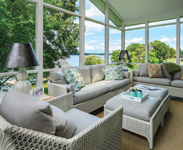
The Kregers’ view over the lake is stunning from every room, but perhaps it’s the most dramatic from the home’s generously sized porches. The porches face in a generally northward direction and thus give residents the chance to capture both the watercolor sunrises and vivid sunsets that Smith Mountain Lake is known for, not to mention panoramic views of the lake. The open-air porch is perfect for grilling, and a covered, screened porch is Pam’s favorite spot. A polypropylene rug mimicking the look of seagrass, white synthetic wicker couches, a chair and twin ottomans all covered in Sunbrella fabric in a soft gray with accent pillows in bright greens and turquoise make the porch feel like a natural extension of the home—another “room” that just happens to have walls made of screen.
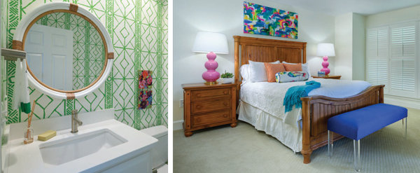
Plans for future changes to the home include more practical hardwood flooring and a bathroom overhaul on the lower level to give family and guests more privacy. Mostly what Pam and Trip plan to do with their townhome is to enjoy it. “It’s such a great place to enjoy family time,” says Pam. “It is exactly what we’d hoped for and we are absolutely as happy as can be with our decision to settle at Water’s Edge.”
SERENE RUSTIC CHIC
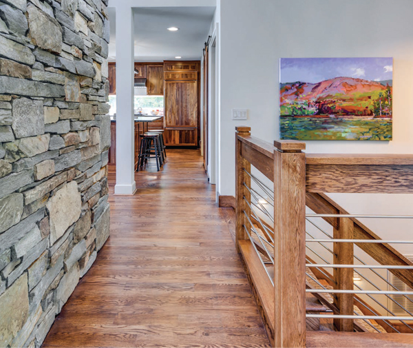
For Joel and Christy Nichols, the decision to settle at Water’s Edge seemed almost made from the start. Though they dutifully looked at lots of options, they kept coming back to the very first townhouse they looked at in 2014. “It was built in 1995 and had not been touched in 20 years,” says Christy. “It was like a blank canvas to us. We could make it our own.”
THE NEW TWOSTORY STACKED STONE FIREPLACE IS THE FIRST THING VISITORS SEE WHEN THEY ARRIVE, THE GATHERING PLACE FOR THE NICHOLS’ FAMILY AND FRIENDS, AND THE MAIN DESIGN FEATURE THAT ANCHORS THE REST OF THE PROJECT.
“It did have a very dated appearance,” Christy adds. “But we didn’t jump right into renovations. We bought the townhome, and then lived in it for over a year.” During that time Joel and Christy kept exhaustive pages of notes detailing improvements and plans for every room of the house for an eventual complete renovation. They painstakingly planned for over year and a half before commencing the total overhaul. Bye-bye white walls, red brick masonry fireplace, and blue Formica … Hello to the spare aesthetic of what Joel describes as “European Mountain Lodge.”
From the very start, Joel and Christy were on the same page about what they were going for with their lake home renovation. When they discussed it, the same word occurred to both of them: Primland.
 Primland is a 12,000-acre resort in Patrick County, and is a long-time client of Joel’s insurance firm, Scott Insurance. Like many such upscale resorts in far-flung places, Primland has cultivated its own unique identity, entertaining guests while blending seamlessly into the natural setting with contemporary rustic features such as stacked stone fireplaces, lots of exposed natural wood, rock, and soothing earthy colors. “Primland has been a special place for us,” says Christy. “Lots of memories have been made there and we love the feel of the place. It seemed natural that we’d think of Primland when we were looking for inspiration for a project like this.”
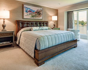 The Nichols turned to an all-star cast to make their 17 months of planning a reality, including Lee Ann Carter of Carter’s Cabinets, Paula Smith Linkous of Paula Smith Linkous Interiors, Craig Balzer of Balzer and Associates, Ronnie Nolan of US Stone, Sally Lauren Nichols of SLN Design, and designer Emily Mangus who also helped with the Kregers’ design. For the renovation, they removed several walls in the upstairs living area, reworked the footprints and design of all the bathrooms and closets, and transformed a dowdy older townhome to a breathtakingly beautiful new space of simple clean lines and welcoming natural details. Thanks to all the Nichols’ careful planning, once the project got rolling, it only took four and a half months to finish.
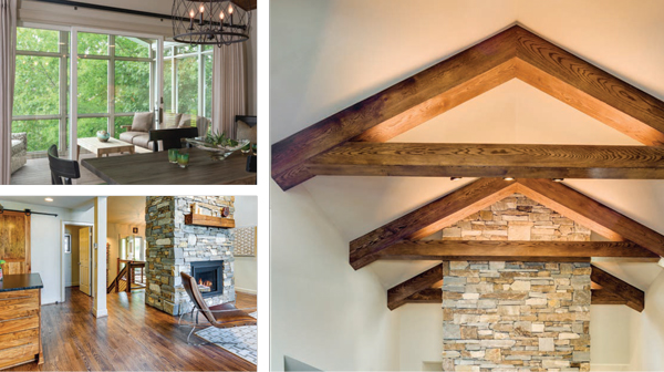
The centerpiece of the whole thing was the soaring two-story stacked stone fireplace reminiscent of the fireplace at Primland. It replaced the original brick fireplace that made up the central structure of the home. This new fireplace would be the first thing visitors saw when they arrived, the gathering place for the Nichols’ family and friends, and the main design feature that would anchor the rest of the project. Building it took time and careful attention to detail. “It was definitely a process,” says Christy. “I came almost every day and worked with Ronnie Nolan of US Stone on stone selection for the design and construction.” For example, on the lower level, the stone is more gray, and on the ground floor it has more chocolate tones. Along with Nolan, and using 14 tons of rock quarried from the same location as the stone used at Primland, Christy helped to create what she calls “the biggest piece of art I will ever make.”
Interior designer Emily Mangus was on hand to help the couple realize their dream of a lake home that felt like Primland—but also like a home—by helping the Nichols select artwork, lighting and furnishings. “Emily’s help was critical,” says Joel. “A theme like ours, of Primland, a European mountain lodge, is naturally going to have a more masculine feel. Emily really helped us to add color and softness in just the right places. Our place would be nowhere near as complete without her input.”
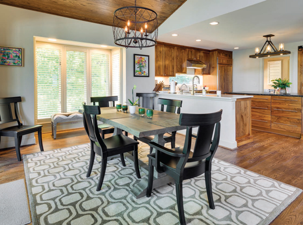
Over his years in the insurance business, Joel has, in addition to Primland, claimed several Virginia and North Carolina furniture companies as clients. When it came time to furnish the lake house, he reached out to his contacts at Bassett, Hooker and Century. Joel and Christy prioritized buying furniture made in the United States, and designers Linkous and Mangus helped them select pieces of outstanding quality that create the “Primland feel” in every room. Perhaps the most outstanding example of this is the dining room table. Made of a solid piece of striated wood with a live edge, the table is a functional piece of art as well as a special memory. “Jeb Bassett is a client and good friend,” says Joel. “He’s also in charge of global wood. When I explained what Christy and I were doing, he invited her to the factory in Bassett, put out 12 slabs of solid oak tops, and let her choose.” The table was custom, or “bench made” right there in the factory and Christy got to watch every step of its creation. “Getting to be part of the process was so meaningful, especially since it was made by friends,” says Christy.
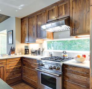 The kitchen cabinets, and indeed all of the custom cabinetry throughout the home, are made of walnut and fabricated by Carter’s Cabinets in Roanoke. Joel and Christy went separately to Carters to look at cabinet materials but ended up picking the exact same walnut finish. “We knew we wanted the natural wood tones,” says Joel. “We were trying to replicate that Primland feel.” That focus kept the couple on the same page. The cabinetry is enhanced by natural stone countertops, made of leathered granite in Absolute Black with a live edge. The kitchen’s sleek brushed nickel faucets and door handles are in keeping with the understated simplicity that the Nichols favor, picking up the silvers and greys in the fireplace stone and metal cording used on the staircase to the lower level.
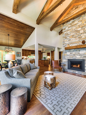
The large open living room is the gathering space of the home. Christy chose coordinating geometric neutral carpets to tie the space with the adjoining dining room. Here, the fireplace dominates. Since Joel and Christy consider the stone itself to be art, they have consciously chosen not to put anything above the antique beam repurposed as a mantel. “We want all eyes on the beauty of the stone,” says Christy. “I look at that rock every day, and I still notice something I didn’t notice before.”
Recessed into the ceiling on either side of the fireplace are giant rustic beams and cross ties, the kind you’d see in an old barn. Here they have the effect of framing the top of the stone creation and drawing the eyes upward. The presence of wood at ceiling height in the living room and dining room brings a warm, natural feel to the upper recesses of the room.
Primland has an elegant fireplace in the Lodge lobby, according to Joel, and it has a unique design: a single flame running down the middle of a bed of glass beads. The Nichols’ fireplace is also striking. The single row of flame is enhanced by tiny shards of black glass that make up the bed of the fire. There’s a comfortable tweed sofa and a leather chair. Doubling as seating and occasional tables are two hair-on-hide stools that Christy spotted one day. “I saw them and immediately knew I had to have them,” she says. “They were just a lucky find.” Behind the sofa is a functional piece of local art: a sofa table made out of walnut from Berkley County, West Virginia and repurposed railroad parts from the Norfolk-Southern Railway.
Aside from the stone fireplace transformation, perhaps the most dramatic change has occurred on the townhome’s covered porch. Though it had a straight view of the shimmering lake beyond, the room’s original screen when the Nichols first purchased the home had been replaced with a DIY four-seasons adaptation: sheets of plate glass held in place by shoe molding. It was hot in the summer and too chilly in the winter. “I called it the ‘Mason jar,’” laughs Christy. During the big renovation, the Nichols replaced all the decking and at the same time decided to convert the space back to a screened-in porch. “What we really wanted was fresh air and no bugs!” says Christy. The furniture is simple and comfortable, and doesn’t appear to be outdoor furniture at all. The cushions on the sofa have the look and feel of leather, and yet are—along with the upholstered chair and ottoman—made of fabric designed for the outdoors. It’s a space made for enjoyment: comfortable without feeling fussy, a relaxed room that allows the lake view to take center stage.
The Kregers and the Nichols may have arrived at Water’s Edge for similar reasons. They may have purchased identically built townhomes in close proximity to each other. Yet their homes have become the canvas for very different visions of what a lakeside retreat looks like: one full of lively color and vibrant textures, the other exuding a sense of the ethereal calm and the earth-toned serenity of a mountain retreat. In the process, these friends have lovingly crafted gathering places for their family, friends, and yes, each other, that they will enjoy for many years to come. ✦
