Photography by Michael Patch
 Smith Mountain Lake resident Peggy Balla and interior designer Robin Titus began their journey together around 2005 in West Palm Beach, Florida. Peggy and her late husband, Bill Golden, brought in an architect for a master bath project in the pool house of their fantastic Mediterranean-style home. Titus was recommended to take on its interior design and the duo’s years-long creative relationship began, sparking a chain of exciting collaborations in a variety of locations to follow.
Peggy is a native of Lynchburg; she grew up in Fort Hill and graduated from E.C. Glass High School. Her undergraduate degree is from Virginia Tech, capped with a nursing degree from University of Virginia. She worked first with the health department in Christiansburg before attending graduate school at University of North Carolina at Chapel Hill. She took a job as executive director of Child Health Investment Partnership (CHIP) in Roanoke where she led the innovative and inclusive program for some years. A decade or so later, now a divorced mother of twin boys, she met Bill Golden—a single father raising twin girls. Romance began and marriage followed; the couple decided where to settle down. “My husband worked in Durham,” she recalls. “Smith Mountain Lake seemed a good place for us to live.”
PEGGY HOPED TO STAY IN THE WATERFRONT AND CROSSED HER FINGERS HOPING FOR A RARE AND MUCH-COVETED PENTHOUSE UNIT TO HIT THE MARKET, PREFERABLY ONE WITH THREE BEDROOMS, THREE BATHS, PLENTY OF NATURAL LIGHT AND SWEEPING LAKE VIEWS. WHEN A PENTHOUSE END UNIT BECAME AVAILABLE, SHE JUMPED ON IT STRAIGHTAWAY.
They found The Waterfront community in Moneta, a development of Willard Construction of Roanoke Valley, Inc., with 750 acres, 8.5 miles of shoreline, clubhouse, pro shop, state-of-the-art fitness center, and banquet facilities. A bar and lounge overlooks the 18th hole of the community’s PGA Championship Golf Course.
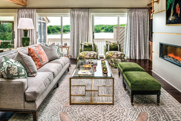
All in at The Waterfront
In 1996, Peggy and Bill moved to the lake full-time, into a townhouse in The Waterfront community. “The boys were in school,” Peggy explains. “It seemed a good fit for us. Then we got Pinky. With all the stairs, the townhouse didn’t work so well anymore.” The outdoor-loving, half-Airedale, half-Labrador retriever was the catalyst that set into motion the couple’s purchase of a modern masterpiece estate in the neighborhood on Anchor Lane. The striking home sits on nearly 11 acres with 600 feet of lake frontage. They lived happily there until Bill died in 2010; Peggy stayed on for a few years but ultimately decided to downsize to a more manageable space. “It was just too much to handle by myself,” she says.
She hoped to stay in The Waterfront and crossed her fingers hoping for a rare and much-coveted penthouse unit to hit the market, preferably one with three bedrooms, three baths, plenty of natural light and sweeping lake views. When a penthouse end unit became available, she jumped on it straightaway. She reached out, of course, to her favorite interior designer, and with that call, Robin Titus and Peggy were back in business.
Now based in Chicago by way of Boston, Titus was happy to work again with, as she describes Peggy, her perfect client. “Peggy really is a dream,” the designer says. “She is collaborative and open as repeat clients often are. It makes for a great journey of partnership.” She made a trip out east to check out Peggy’s new digs. Her first impression: “Whoa. It was very dated, very ‘1970s,’ and a significant downsize for sure” from more than 5100 square feet to just around 2100. She saw the potential though. “Peggy thought the unit was tiny but I didn’t think so. The vaulted ceilings made the space feel so airy. And the view was amazing,” she adds.
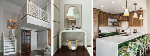
Upscale downsizing
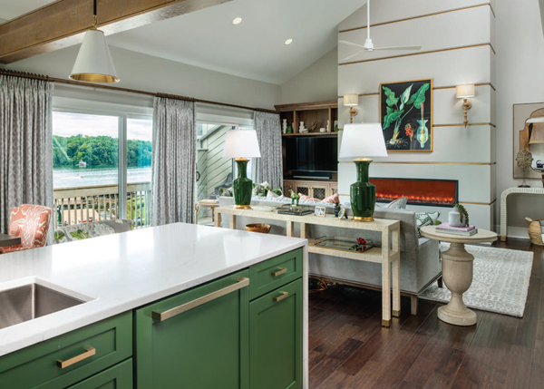
The first step was hiring Ken Brodin Builders to handle contracting duties; they demolished the stairs and opened up the kitchen first. “We wanted to make a grand room even though the square footage of the space was small,” Titus says. They focused on verticals, revamping the fireplace and adding new custom stair rails. They also replaced the floors; the original flooring was basically carpeted plywood. Titus recalls, “The fireplace was awkward and outof- scale. It had a small square insert in a large rectangular surround, so we created a brass-inlaid wood recess with coordinating flanking cabinetry.” Titus and Peggy loved the fluid, hybrid theme emerging—a bit modern and not too cottage-y, with a healthy sprinkle of traditional lake house style. “Touches like wire cabling along the stairs helped us overlay the comfortable vibe with a clean, modern finish,” says Titus. A barn door from Black Dog Salvage masks the foyer closet, adding a bit of age and architectural detail that grounds the space.
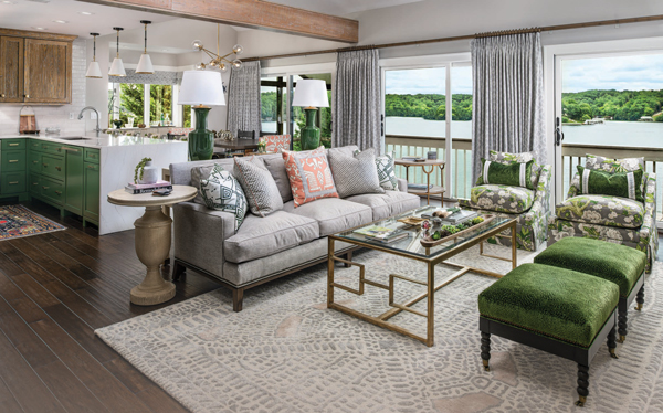
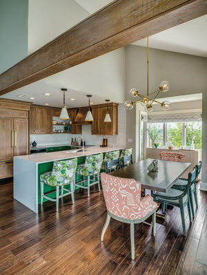
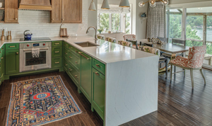
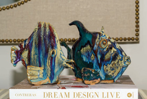 The grand room and dining area, now open to the kitchen, felt more open, airy and bright. Titus says, “We used handmade brick tile from Fire Clay Tile for the backsplash and finished the counters with a sleek waterfall edge.” In contrast, the oak cabinets are wire-brushed—a treatment that roughs up wood so it takes stain and glaze in different ways. “The result is a style that feels clean—a bit Shaker-ish and a little rustic,” the designer says. Upholstered dining chairs and stools were chosen with short captain’s backs and covered in “Bali II” fabric from Quadrille’s China Seas line. The lower chair profiles don’t impede the view of glimmering lake hues of blue and green; these tones inform the muted palette that unifies the design. A vintage dining table base was sourced locally on an antiquing junket; its tabletop is a custom piece made of white ash by Bowman Woodworking in Ferrum. Light and bright drapery and shades for all rooms are custom creations by Curtains, Blinds and Baths in Forest. The buffet is from Ballard Designs and showcases Peggy’s ceramic and glass fish collection to add seaglass-toned whimsy.
In the living room, swivel chairs make for easy conversation and enjoyment of lake views, all done up in “Bermuda Blossoms” from Schumacher’s Mary McDonald Collection. The sofa table is a raffia-covered console by Society Social, a North Carolina design house offering one-of-a-kind pieces handmade by a team of area artisans and craftsmen. Fireplace sconces are hand turned by Dunes and Duchess, a Connecticut firm.
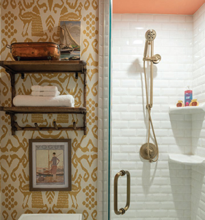 “The downstairs bath got a whole different flip-around,” Titus says. They wanted to make Peggy’s adjacent master bath and closet larger, so they shrunk the small bathroom further. It has a tiny sink set into a spoolturned, hand-crafted vanity. Its light fixture was upcycled from a vintage basket and brass fixture by Stuart Schwadron at Yellow Mug (who happens to be Titus’s husband). “The wallpaper pattern mirrors the fabric we chose for the dining room captain’s chairs but in a different colorway,” she adds with a chuckle. “I loved sneaking that in.” The bamboo wall storage shelf is an old piece that showcases vintage seashore paintings. “We laid it out so we could even give Peggy a tiny corner shower for occasional downstairs guests,” the bubbly designer remembers. “It’s a gem of a bath.”
Marriage of styles
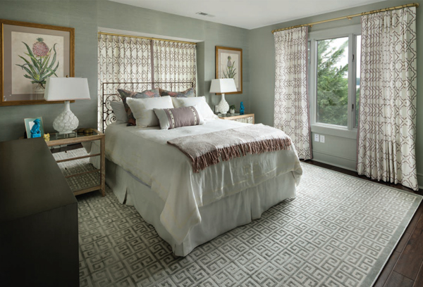
For the master bedroom, the goal was serenity. “Though we used patterns and color everywhere else, for the bedroom we chose subdued green and muddy aqua highlights, Thibaut grass cloth wallpaper and custom drapes in Kravet fabric—pale, pale lavenderbordered linen,” Titus says. Bedding is from Eastern Accents of Chicago and the euro pillow fabric is by Kelly Wearstler, sold by Lee Jofa.
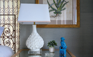 Peggy and Titus found a pair of vintage lamps with a scallop design, made in Italy and purchased in Chicago. “I put new acrylic bases on the lamps and trimmed new shades to tie them into the room,” says Titus. “Antique, hand-painted prints from Italy were framed locally by Artfully Framed in Moneta. We added cerused oak nightstands with mirror tops from Made Goods,” says Titus. Cerused oak dates to the 1500s, when the white lead traditionally found in cosmetics was discovered by furniture makers for finishing porous woods. When applied to oak, the white pigment of the ceruse finish fills cracks and crevices and reveals the wood’s grain lines, adding dimension to the wood without affecting its color. Cerused oak (also known as limed oak) has come back into fashion; for obvious health and safety reasons, traditional lead has been replaced for modern use by nontoxic wax products.
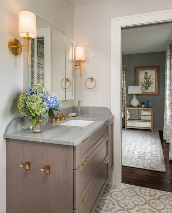
In the master bathroom, the design is clean—a marriage of modern and traditional. Classic subway tile here has a fresh and wavy handmade finish. “We added super-modern fixtures by Newport Brass and floated the sink cabinet,” Titus explains. “If you don’t need every inch of storage space, consider ‘floating’ bathroom elements to make more tile visible, giving the room a feeling of expansiveness.” The larger bath accommodates a longer vanity, and floor tiles are made of super-thick, handpoured cement which will age and wear in beautiful ways. She offers this caution to those contemplating cement tile: “In hightraffic bathrooms, cement tile is not a great idea, but for Peggy’s use it’s fine and the patina developing is perfect. Cement tile is a perfect choice for foyers, by the way.”
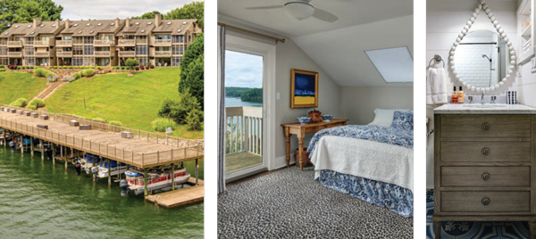
Upstairs, the guest bedroom pairs a leopard rug with blue and white elements Peggy already had. Fun antique pieces include an old console table. The stunning lake and treetop view from the private patio add to the cozy welcome of the space as Peggy’s artwork delivers pops of blue and yellow. In the guest bath adjoining, Titus added shiplap and nautical fixtures from Anthropologie to dress it up. The tile is blue and white; a sailboat picture and boating-themed detail on the mirror add charm to the bathroom.
Lighting was the final element; new LED lighting was installed in the kitchen and the tiny, retro foyer light was replaced with an updated, Art Deco-esque fixture. They added recessed lighting in the living room, and LED lights in bookshelves and under cabinets. The dining chandelier is all metal, glass and sleek. The prime directive, according to the designer? “Don’t intrude on the view.”
Home on the lake
Upon reflection, Titus says, “I felt so proud upon finishing this project. My client just loves it.” Even though the overall feel is not obviously “lake house” or “boathouse,” there are thoughtful details—ship’s wheel motifs and touches throughout, sailboat paintings, weathered woods here and there and glimpses of unfinished brass. All these elements bring this lovely aerie into perfect waterside harmony. Peggy Balla is again, for the third time, home on the lake. ✦
