One thing that can be enjoyed year-round when living lakeside is the view. No matter the season—whether springtime blooms, summer sunsets, fall foliage or wintery snowscapes—the eye is always drawn to the interplay of water, sky and landscape.
Is it any wonder then that most new construction and renovation projects are undertaken with the goal of opening up the rooms of the home, uniting kitchen, dining and living rooms into one “great room”? The goal is most often the creation of an open-concept space that capitalizes on the ability to accommodate togetherness while showcasing beautiful Smith Mountain Lake views from every room.
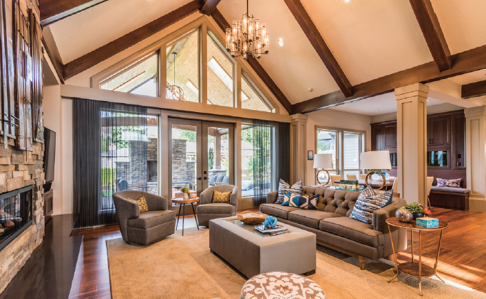
 Uniting several rooms into one great room also can have its challenges, however. For instance, great rooms can sometimes feel too big, too open and too cold. Cathedral ceilings and a profusion of windows can exacerbate the sensation of being dwarfed in a giant room.
Additionally, it can be difficult to find a balance between space and purpose in a large room. For example, homeowners may need to balance friends and family who want to watch a game on the big screen with others who might desire a quiet space for reading or conversation.
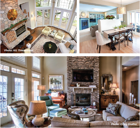
The answer for those struggling to come to terms with how to best utilize their great room space is to break it up into smaller zones built around the various uses your family and guests enjoy. Zones might include areas for food preparation, bar, dining areas both formal and casual (think barstools at a counter) and a television space with comfortable, casual seating oriented in such a way that programming may be comfortably watched.
Another zone idea to consider is a quiet nook away from the television with relaxed seating where two or three people might gather for a cup of tea and conversation. Include a small table that can be used for extra seating when entertaining, but also for crafts and board games. If there are very young children in the family, you might also consider a small play zone with storage for a few baskets of toys or books built at child level and perhaps a child-sized table, as well.
Zones can and should be customized to match the way your family will use the space, so everyone’s input is important. Remember, these rooms often unite several rooms so it should be unsurprising that this space will have to accommodate several purposes.
Rugs and Furniture
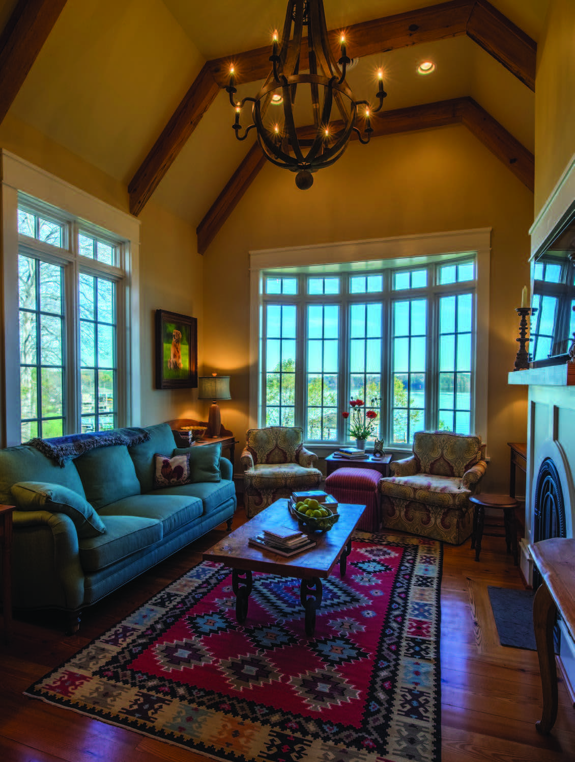
While you want your various zones to flow, you also want them to be visually separate. One of the best ways to delineate the zones in your great room is by using area rugs. The current trend is to “float” your furniture arrangements—meaning that furniture is arranged away from the room’s walls. So, imagine your entire space as a lake (not unlike the one outside your windows), and area rugs are your islands where you will construct each zone. You can purchase two or three of the same rugs or choose complementary ones in various sizes to best fit each arrangement. If your great room is of more modest proportions, consider rugs in neutral colors.
You will need to plan for and allow space for movement between your islands/zones and each will need a focal point (a piece of artwork, a beautiful hearth, the television, or simply a gorgeous view, showcased by windows and doors) and a sense of balance. Note that “balance” does not mean you need to maintain perfect symmetry. Juxtaposing placement of a heavy piece of furniture such as a grand piano with a grouping of smaller pieces will help achieve balance.
To that end, make sure your furniture is sized proportionally to your room and to the other parts of your tableau. For example, a delicate antique settee will look lost in an oversized room with very high ceilings and windows, but a pair of large, overstuffed sofas will look right at home. Keep in mind the old adage used by good hosts and hostesses: Make sure that every seat has a comfortable (and obvious) place to put down a drink.

Lighting and Color
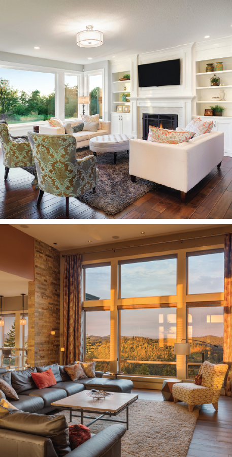
Since great rooms incorporate several rooms into one, it is important to coordinate your use of color throughout. Many designers recommend painting the walls a light or neutral color. This is an especially good idea for lakeside homes as it helps to focus attention on the beautiful views. Neutral walls do not mean that you shouldn’t incorporate color, though. Choosing a “signature color” is a great way to enhance the visual flow throughout the space. A splash of turquoise or persimmon, for example, that pops up in the kitchen backsplash, the arrangement on the dining table and the throw pillows in the seating areas, is a perfect example of carrying a signature color throughout. Doing so will visually unite the zones while still maintaining their separate purposes.
During daylight hours, the sun’s power is often intensified because of the reflective property of water, so fading and sun damage are real concerns for homeowners who live lakeside. Be sure to request UV treatments for fabrics, rugs and upholstery, if possible, and take care when placing antiques in direct sunlight.
To enhance evening time spent in your great room, you’ll want to create a lighting plan for each zone. Depending on the height of your ceilings, you may want to consider overhead lighting. Very high cathedral ceilings deserve high-impact lighting, such as a large-scale chandelier to illuminate their upper reaches. Additional thought is warranted for lighting each zone. Overhead lighting might be fine over the dining area, but will not be adequate for zones where one might be reading a book or working a crossword puzzle. In these areas, task lighting in the form of table lamps, sconces or directional cup lights embedded in the ceiling might provide the additional light that’s needed.
 Accommodating Technology
Often the hardest decisions when decorating or even rearranging a living space have to do with technology. We tend to have a love-hate relationship with the television, cable box, DVD players, gaming consoles, speakers and the many other components that make up the entertainment area. We love having friends over to watch a big game; we enjoy the sound of music playing in the background while we entertain; we need wi-fi for our phones, tablets and computers, but all those boxy components, unsightly wires and expansive TVs can negate the aesthetic appeal of the elegant and inviting space you’ve carefully planned out.
But like it or not, technology has become integral to our lives, so it’s only reasonable to incorporate the use of it into your great room planning. There are various ways to hide components, and even the TV when it is not in use. Built-in or custom furniture can hide all those black boxes and, if you like, close the door on the television when it’s not in use. Outlets for charging laptops and phones can be installed in the floor under couches or chairs to prevent wires from becoming a tripping hazard (and they work beautifully for table lamp cords as well). The key to decorating around such technological necessities is to incorporate them into your plans from the start. Don’t wait until you have the “perfect” great room arrangement and then start trying to figure out where to put the giant flat-screen TV.
Remember, too, as you go about the process of imagining or reimagining your great room layout, that nothing is set in stone. Sometimes you need to live with an arrangement for a while before determining if it’s working or not. There are no hard and fast rules, so if you try something in one place and feel it’s not ideal for your family, you can rethink and rearrange. Repurpose the space as your family’s needs evolve, or, if you like, change things up with the seasons or even your mood. The versatility of the great room is what gives it timeless appeal and figuring out new and better ways to use the space will keep it fresh and inviting for years to come.
Some photography provided by: KG Thienmann and Craig Shaffer
